PageBuilder Widget Guidelines
Tips and tricks to get the most out of the more complex PageBuilder widgets
Introduction
Please use this page for guidance on how to properly configure your widgets. You can also find additional tools that will help with widget positioning and styling.
If you would like more general advice on how to construct web experiences with PageBuilder, please view the PageBuilder Best Practices.
Guidelines
Spacing
PageBuilder includes a wide range of shorthand responsive margin and padding utility classes to modify a widget's appearance.
Assign responsive-friendly margin or padding values to a widget or even a specific element in HTML to a subset of its sides with shorthand classes. Includes support for individual properties, all properties, and vertical and horizontal properties.
To apply these classes to a widget, add them to the 'wrapper class' parameter in the widget options. You can add multiple classes using a space to separate them.
Notation
Spacing utilities that apply to all breakpoints, from xs to xl, have no breakpoint abbreviation in them. This is because those classes are applied from min-width: 0 and up, and thus are not bound by a media query. The remaining breakpoints, however, do include a breakpoint abbreviation.
The classes are named using the format {property}{sides}-{size} for xs and {property}{sides}-{breakpoint}-{size} for sm, md, lg, and xl.
Where {property} is one of:
- m - for classes that set margin
- p - for classes that set padding
Where {sides} is one of:
- t - for classes that set margin-top or padding-top
- b - for classes that set margin-bottom or padding-bottom
- l - for classes that set margin-left or padding-left
- r - for classes that set margin-right or padding-right
- x - for classes that set both *-left and *-right
- y - for classes that set both *-top and *-bottom
- *blank* - for classes that set a margin or padding on all 4 sides of the element
Where {breakpoint} is one of:
- *blank* - extra small devices (xs) are represented by default and do not need to be explicitely noted.
- sm - small devices (phablets, landscape phones)
- md - medium sized devices and very small desktops (tablets, half screen windows)
- lg - large devices (tablets on landscape and desktop)
- xl - extra large devices (full screen desktop)
Where {size} is one of:
- 0 - for classes that eliminate the margin or padding by setting it to 0
- 1 - Extra-small spacer (* .25)
- 2 - Small spacer (* .5)
- 3 - Medium spacer (* 1)
- 4 - Large spacer (* 1.5)
- 5 - Extra-large spacer (* 3)
- auto - for classes that set the margin to auto (equal spacing)
Examples
mt-0Sets the margin along the top edge to 0.
ml-1Sets the margin along the left edge to extra-small.
px-md-2Sets the padding along the left and right side (the x-axis) to small for medium screen sizes and larger.
p-lg-3Sets the padding along all sides to medium for large screen sizes and extra-large screen sizes.
The layout widget handles widget positioning, order, and responsiveness of contained widgets on mobile devices. Almost the entire Wiley Online Library site and its hubs use a grid system built up of rows and columns, the layout widget is an accessible way to recreate this in pagebuilder.
In most situations, changing the layout will not be necessary. Content reads best stacked one piece on top of another, adding multiple columns to the current structure can reduce the readability of a page. If everything is aligned next to eachother near the top of the page, there is no clear 'go to' content and the user may bounce off.
However, in some situations, you may want to align images (or other elements) to the left or right of copy in a reliable way that responds appropriately on mobile devices. Layout widgets have a number of properties that allow the user to create columns and choose when columns stack as the screen size becomes smaller.
A layout widget can support any number of columns, but only a maximum of 12 'column units' can be rendered along the horizontal before remaining columns begin to wrap onto the next line. The columns are made up of units ranging from 1 to 12. For example, you could have one 12 unit wide column that spans the entire width of the container, or a 9 unit wide column and a 3 unit wide column next to eachother. Or you can have 10 x 1 unit columns and 1 x 2 unit column.
The same grid structure is used in a web toolkit called bootstrap. For a more thorough explaination of grid systems, please view the Bootstrap explanation.
Note that the specific implementation of the bootstrap grid differs to the grid used on WOL and its hubs, but the principles remain the same.
The rich text widget should be familiar to most users who have engaged with page design tools on other platforms, like wordpress.
The widget offers accessible, familiar tools that can format and display images and copy. We adivise that users are vigilant when pasting copy to ensure that extra styling is not brought onto the site, as this can create inconsistancies in the visual presentation of your content and the rest of the site's interface.
On a windows PC, you can copy the text from any source and paste it into a Rich Text widget using the ‘CTRL + Left Shift + V’ command to paste the text without the unwanted styling. If this isn’t possible, please select all the content once it has been pasted into the widget and click the small rubber (eraser) icon in the rich text editor to reset the formatting. Then highlight the individual headings and use the style dropdown to reinstate heading styles.
The rich text widget supports and HTML view for those users that are confident enough to make modifications at that level. But we do ask for extra styling to be kept to a minimum and that the site's default styling is adopted.
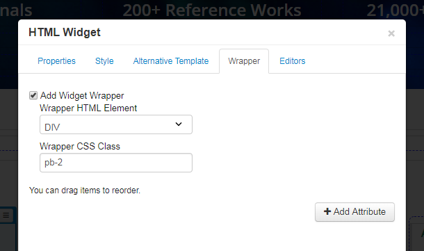
The HTML widget is a more direct way than the rich text widget of adding HTML content to your page. Please be sure to keep extra styling attributes to a minimum and inherit the default styles from the site.
When creating more complex HTML structures, try to use the layout widget to handle the positioning and ordering of content.
The carousel widget can appear complicated at first because the page builder rendering differs significantly to the published version. This is because you will edit a 'deconstructed' carousel in page builder.
Use the widget options to set the parameters of the carousel (number of slides, timings, etc.) and then build each slide like you would any other piece of content on your site. Use the layout widget to create a consistent layout for each slide and make them responsive.
The accordion widget operates similarly to the carousel widget. Adjust your accordion parameters and populate each accordion container like you would any other piece of content on your site.